Context & problem
NPO's Trinity Dashboard holds a lot of valuable data, but turned out not to be equally accessible to every user. Users had varying levels of data literacy, which meant interpreting and using the available data wasn't always straightforward.
For my graduation project I researched how the dashboard could be made more user-friendly and accessible. The goal was to give users more control over the data and support them in making data-driven decisions.
As the sole designer, I was responsible for the entire design process: from research and concept development to prototyping and testing.
Research & audience
To better understand the problem and users' needs, I spoke with 10 frequent users of the existing Trinity Dashboard. During these in-depth interviews I looked at, among other things, how they used the dashboard, what information they needed and what issues they ran into.
Questions ranged from "How often do you use the dashboard?" to "Are there parts you find difficult or frustrating?"
Alongside the interviews, I used various testing methods throughout the project. For example, after an initial prototype I gathered feedback through a survey, and later had a UX expert review the design.
The research showed that users mainly needed more overview, clearer interactions, and an interface that guides them through the data step by step.
Process & decisions
Based on the research, I developed several iterations of the dashboard. Each iteration was tested and improved based on new insights.
An important part of this was a heuristic evaluation with an experienced UX designer, using Nielsen's 10 usability heuristics and the think-aloud method. Among other things, this revealed inconsistencies in the exit buttons and showed that the design had room for additional functionality.
I incorporated these insights into the next iteration.
I then carried out usability testing with 5 users. They performed various tasks with the prototype, which let me examine how intuitive the interface actually was in practice.
One concrete insight from these tests was that users struggled to interpret the drag-and-drop icon. So I adjusted the icon and added a hover function that explains how the interaction works.
Throughout the process I also explored how ML/AI and personalisation could become part of the dashboard. As part of this, I built a predictive analytics model in Python to forecast viewing figures. The design was therefore not only aimed at making data clearer, but also at supporting users in interpreting it and making decisions.
Result
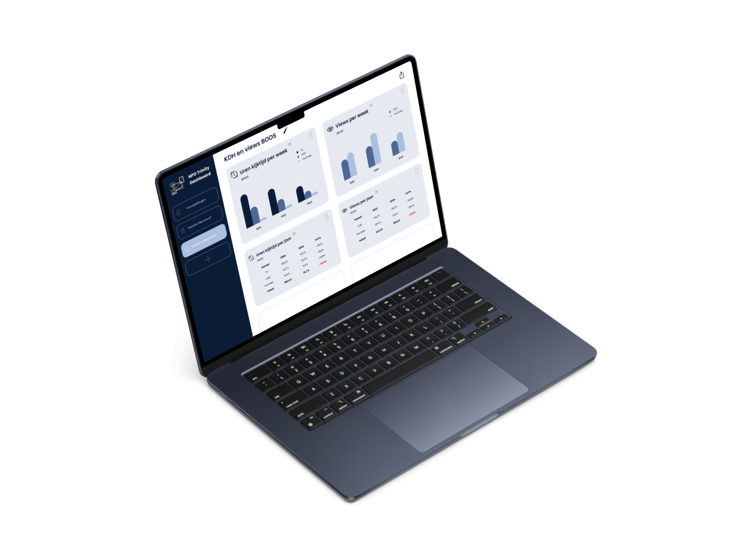
The result is a renewed dashboard prototype where data is presented more clearly and users are guided through the interface in a more intuitive way.
The renewed version was received positively by the test users. At the same time, testing surfaced new opportunities for further development — for instance, a need for more extensive filtering options and more freedom to adapt the dashboard view to personal needs.
Alongside the prototype, I developed a design framework that leaves room for future integration of ML/AI and personalisation features. The wireframes and components I designed can therefore also serve as a foundation for further development of the Trinity Dashboard.
Reflection
This project mainly taught me how important it is to not just make a complex data product visually clear, but above all to design from the way users understand and work with information.
By combining different research and testing methods, I was able to keep validating and substantiating design decisions. As a result, my focus shifted from "How do I display a lot of data clearly?" to "How do I help users find meaning in that data?"
As a designer, I went through the entire UX/UI process within this project: from identifying the problem and conducting research to designing, testing and iterating on a digital product.